TRA Research and Analytics Office
TRA Research and Analytics Office

Behind The Design
TRA are a leading edge research and analytics business who are at the forefront of their industry. A key part of what they do is gathering and analyzing consumer information for their clients, offering insights to unlock and drive new avenues for growth. We wanted to play on the capture and processing of information and somehow translate what TRA does into a 3 dimensional form, into the architecture of the space.
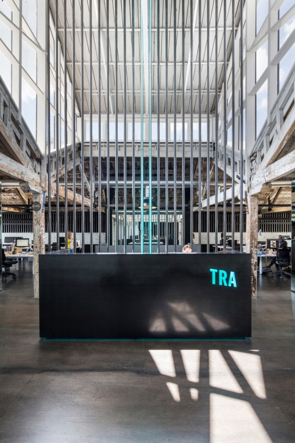
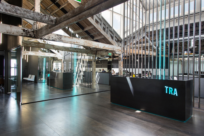
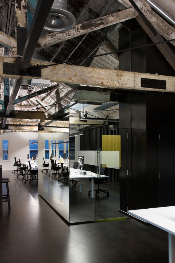
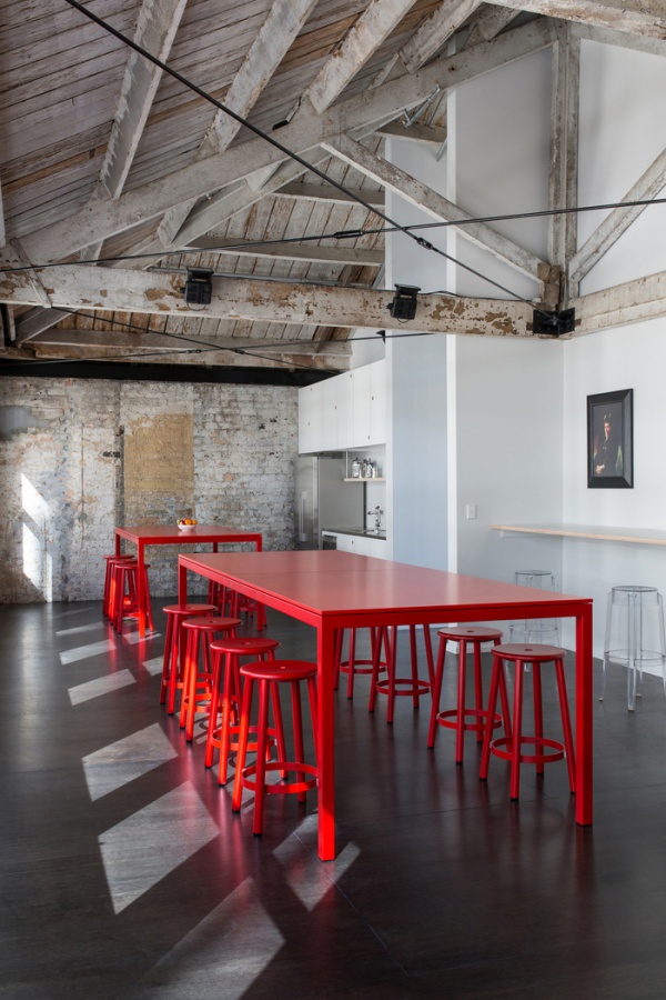
The existing space was on the top floor of a 100 year old heritage building adjacent to the ports of Auckland, the space was comprised of 2 hipped roof forms with a central 7m high loft set between them. All of the timber trusses and structure were exposed and had been uncared for, with some areas showing signs of fire damage. We saw the raw nature and patina of the existing space as an important part of the history and character of the building and we wanted to immortalise and accentuate it rather than mask it.
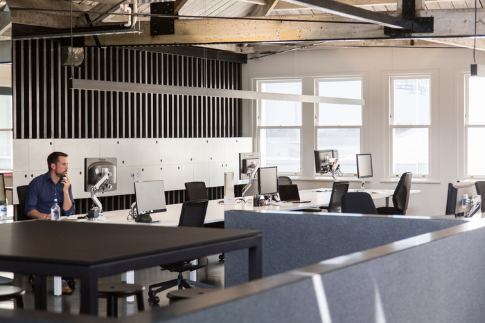
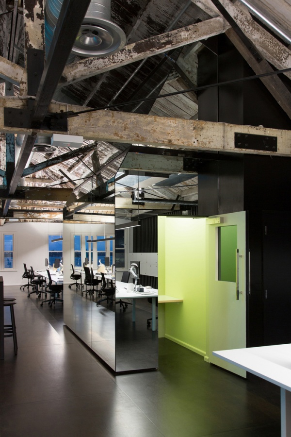
The spatial brief asked for an open plan office of 40, including a boardroom as well as a series of smaller meeting rooms and a staff break-out area. In order to preserve the character and not dominate the existing space, the new spaces were created by the insertion of pragmatic volumes within the existing framework. These volumes were then clad with mirrored panels so as to dematerialize, reflect and accentuate the raw fabric, in particular the history and patina of the existing building.
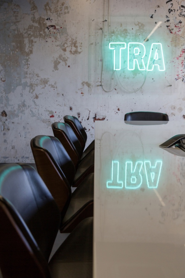
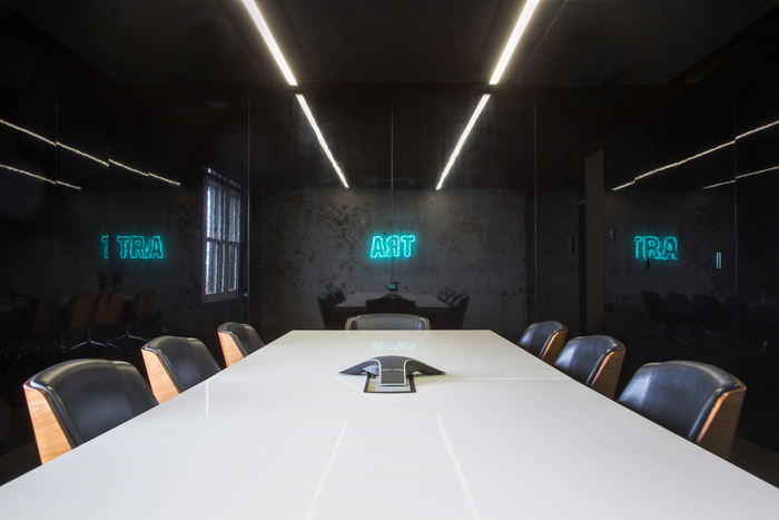
As part of their rebranding, artist Paul Hartigan was commissioned to create a neon artwork of their new abbreviated name TRA. Playing off this, we introduced neon into the heart of the space to represent the continual flow of information/data running through the company, it is ethereal, energy filled, 24/7.
The existing timber floorboards were damaged beyond repair and could not be salvaged. Rather than replicating these with a new equivalent, we saw this as an opportunity to create something unique and introduced a module of 1.2m x 2.4m stained meranti plywood panels as the finished surface. The size of the panels enhance the scale of the space and were set out in a repetitive staggered pattern across the entire floor, creating a grid, giving order and setting up a rational framework on which to process the information flow, the neon. The mirrored wall panels are the same module size as the floor and precisely align with the meranti plywood flooring, further enhancing order.
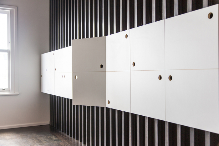
Black acoustic insulation was introduced onto the back walls of the open plan workspace, this is held in place by vertical raw steel sections. The brief called for individual lockers for each staff member, this was conceived of as a line of floating data set within the vertical steel, a pattern of circles set within the form that also double up as handles. This circle pattern is also applied to the kitchen cabinetry.
A mirrored volume was created within the central back wall of the open plan workspace. This has 2 small retreats within it for staff to use for private calls or more focused work. Stepping into these is like a pause in the data flow, moving away from the light into a smaller more intimate space, in contrast to all the energy flowing around the office.
Design by: | > See all offices by this designer | |
| Location: | Auckland, New Zealand | > See all offices in this country |
| Construction Year: | 2015 | |
Photographs by: | Jeremy Toth | |
| Office Size: | 4200 sq. ft. |
| Colours (click to search): |
