iSelect Office Design
Design by V ARC


iSelect Office Design
Design by V ARC

iSelect embraced ‘out there’ design solutions and really supported out of the box thinking. In that respect iSelect and V Arc were a perfect match. V Arc aimed to flip the concept of what a call centre is on its head, and create a working environment that was not only striking but fostered communication between staff across all departments and levels and promoted their achievements.
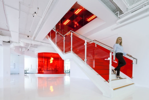
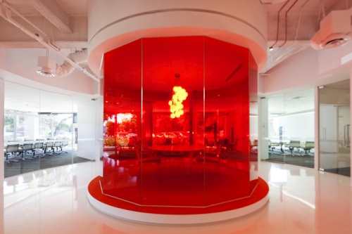
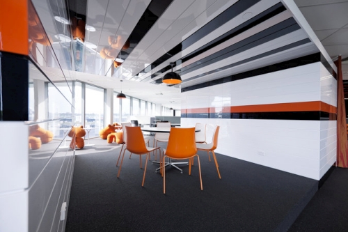
The Front of House makes use of the iSelect corporate colours, orange and white. With stark white epoxy floors and bold splashes of orange, the front of house has a number of quirky spaces including the round “interrogation room” and white internal stair which was part of the design brief to ensure great vertical integration throughout the floors.
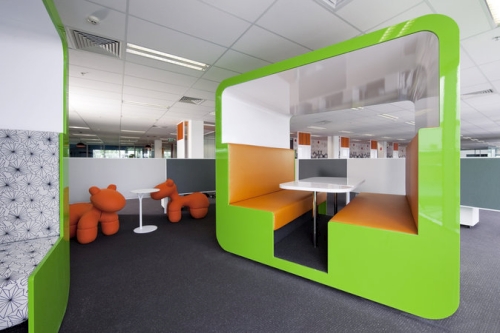
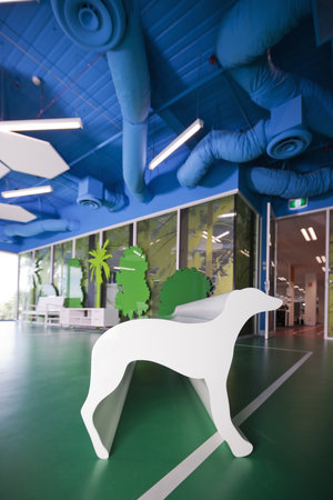
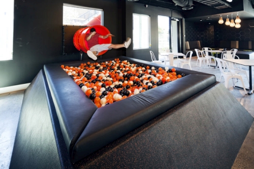
Throughout the call centre and corporate workplace, the design incorporates a variety of meeting, touchdown and informal collaboration points for team discussions and a two lane running track around the core to facilitate walking meetings. Just one of many design quirks, the running track leads to a soccer pitch, sun hammocks complete with ocean views, whippet stool and a slide which exits the facade of the building and lands you in a ball pit within their full service 300sqm cafe and entertainment precinct which sits adjacent to the reception and front of house meeting suites.
Company website: | ||
Design by: | > See all offices by this designer | |
| Location: | Victoria, Australia | > See all offices in this country |
Photographs by: | Yvonne Qumi |