Indeed Recruitment Office Design by Edgequarters
Indeed

Behind The Design
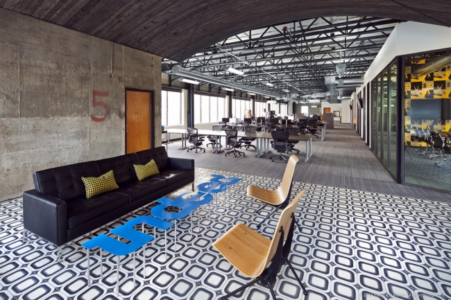
Instead of the typical wall mounted sign that you see in most company reception areas, we opted for a collection of letter cocktail tables that spell out Indeed. The two slipper lounge chairs repeat the lines of the ceiling while the sofa grounds the rather large reception area.
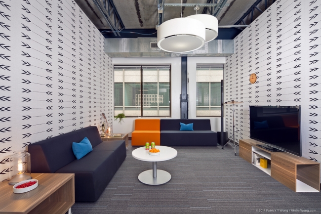
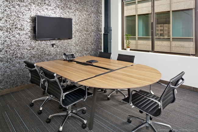
The black and white color scheme made it easy to create themes for the offices much like we did for Foursquare’s Soho office, but on a less exaggerated level. We created a subtle change in feeling from one conference room to the next by accenting one wall with a bold patterned wall covering. I especially love how the industrial quality of the lightbulb wallpaper in the large conference room ties in with the room’s exposed duct work. We chose a pattern of arrows for the open lounge space to balance the scale of the room and give it a fun and casual feeling.
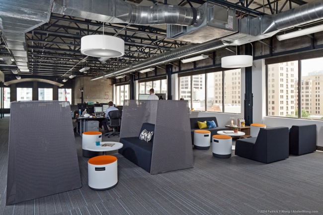
As for space planning, Derek and I decided to go with a central office lounge area that connects with the open office with rows of desks on either side. In order to really delineate the area, we played with scale of furniture, dropped pendants, and used various types of seating and lighting to get that feeling of comfort at work.
Design by: | > See all offices by this designer | |
| Location: | Austin, Texas, USA | > See all offices in this country |
| Colours (click to search): |
