Touch Digital by Post Office Design


Touch Digital by Post Office Design

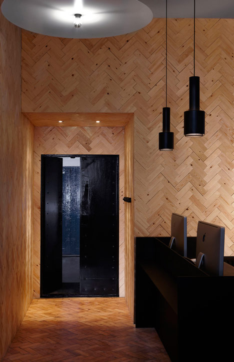
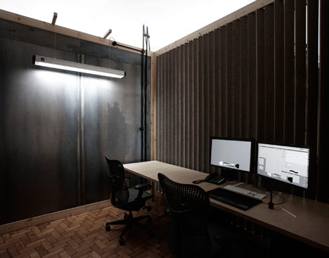
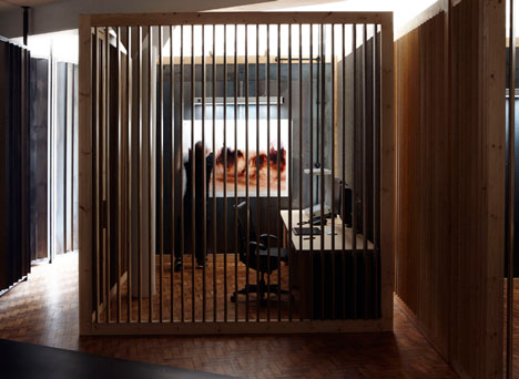
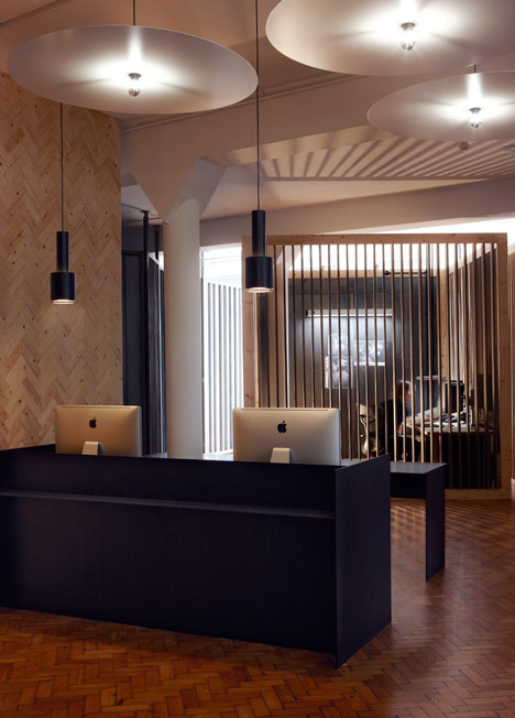
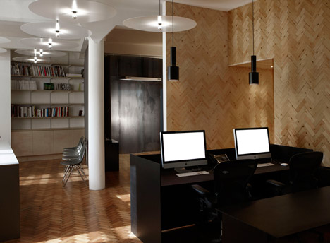
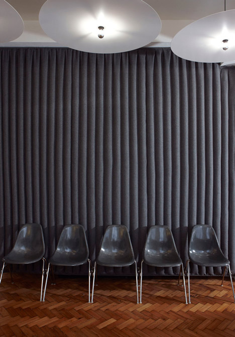
Digital retouching agencies need a minimal amount of light in order to correctly visualise the computer screens. This constraint usually makes retouching studios a dark environment. We took this challenge to heart as we wanted communal areas of the new touch offices to be bright and airy whilst providing low-light environments to facilitate the retouchers work. The new touch offices maximise the already generous amounts of space and light the warehouse space had to offer. The space owes its aesthetic and choice of materials to scandinavian classic modernism as well as 60’s corporate american grandeur as well as the minimal art movement. The central retouching booths appear as minimal sculptures in a grand setting rather than individual work spaces. All of the retouching environments are lined in grey felt in order to offer a colour-neutral background for the retouchers while helping to noise-proof the open workspaces.
Company website: | ||
Design by: | > See all offices by this designer | |
| Location: | London, UK | > See all offices in this country |
Photographs by: |